Project Brief
Sales Giant Network needed an identity system that could communicate growth, structure, and scalability without relying on overly complex visuals. The goal was to create a modern logo suite that felt professional, adaptable, and instantly recognizable across both digital and physical applications.
Approach & Implementation
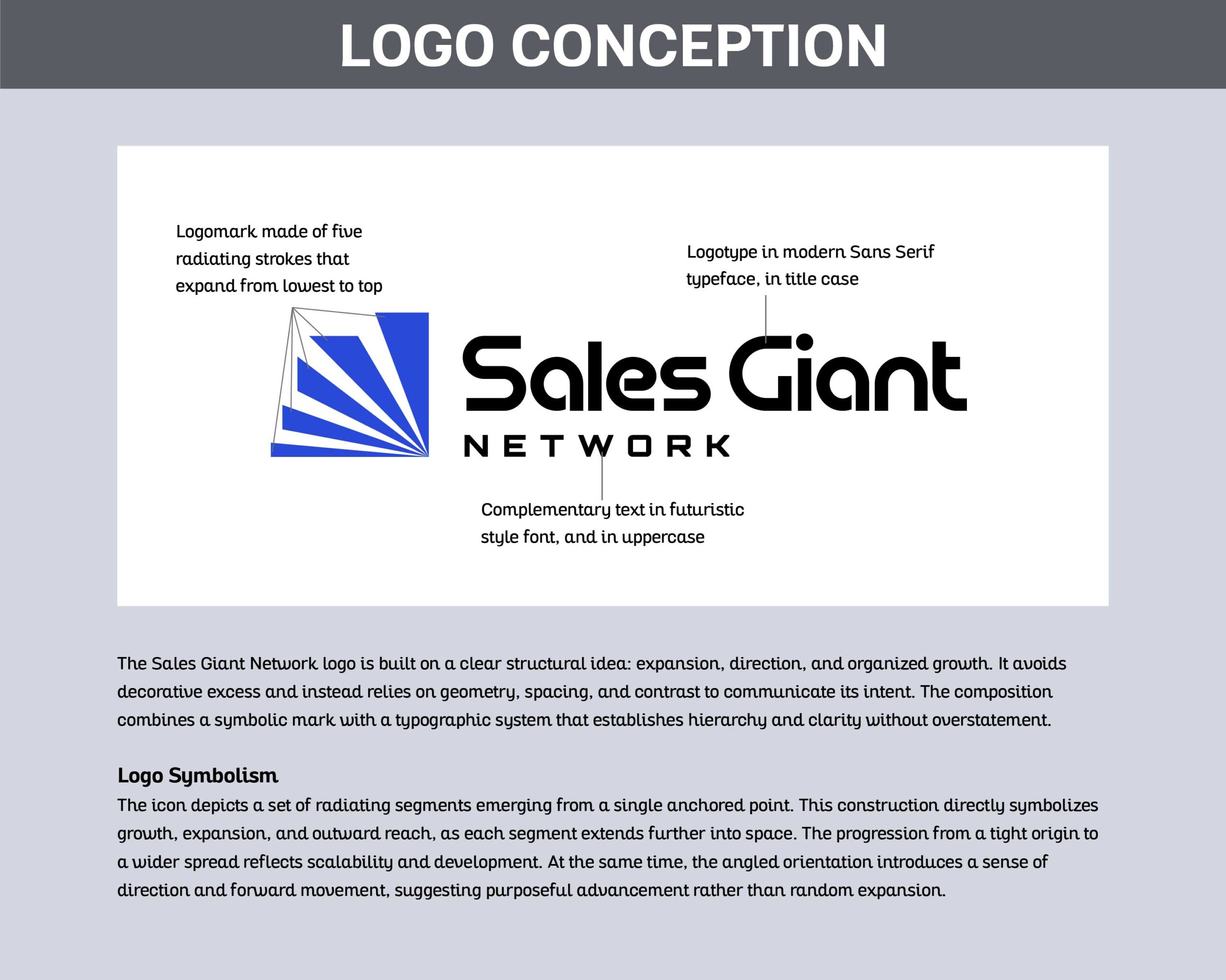
The identity was built around a geometric symbol made of expanding radiating strokes to represent growth, direction, and outward reach. The typography system paired a structured sans-serif wordmark with a futuristic secondary type treatment to create hierarchy and clarity within the brand.
To ensure flexibility, the system was expanded into multiple logo configurations including a primary logo, secondary logo, submark, standalone logomark, and responsive variations optimized for different environments and scales.
Outcome
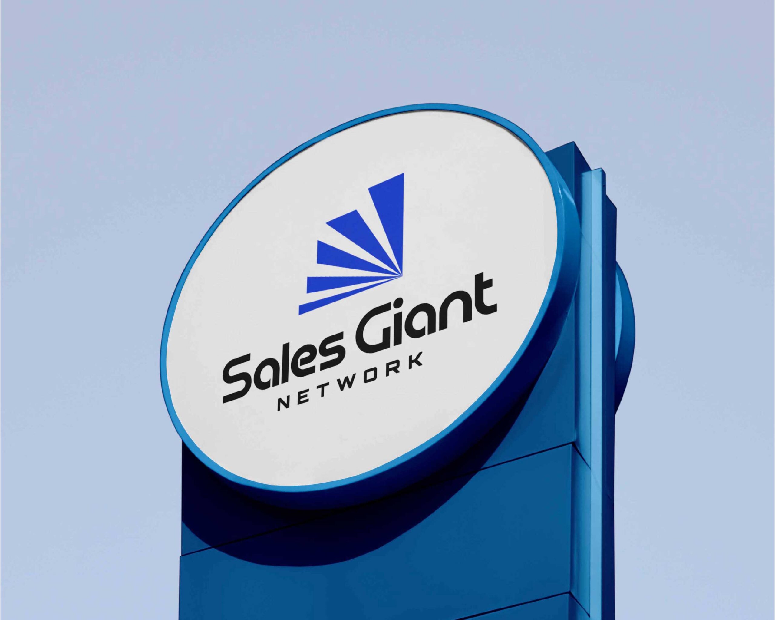
The final identity system gives Sales Giant Network a clean and scalable visual presence built on structure, consistency, and clarity. The result is a modern brand system that communicates expansion and professionalism while remaining versatile across print, digital, apparel, and interface applications.
Happy Viewing 👇🏽✨