Project Brief
FirstNature required an identity system that could visually connect ideas of wellness through nature, with growth, and environmental grounding through a structured but approachable design language. The objective was to create a flexible logo system that balanced organic symbolism with modern clarity across digital, packaging, and merchandise applications.
Approach & Implementation
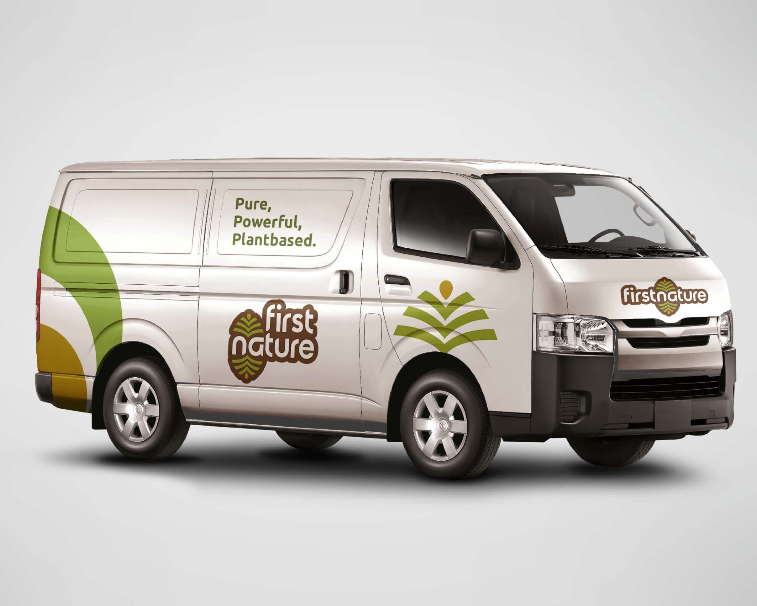
The identity was built around a botanical symbol combining roots, leaves, seeds, and fruit to represent growth, renewal, and natural balance. Rounded typography and thick strokes were paired with the symbol to maintain clarity while creating a softer and more accessible visual character. The system was expanded into multiple configurations including a primary logo, secondary logo, and standalone submark to support flexibility across different formats and scales. A nature-driven colour palette of greens, browns, gold, and white reinforced the brand’s connection to earth, wellness, and sustainability.
Outcome
The resulting identity system provides FirstNature with a cohesive and adaptable visual presence grounded in natural symbolism and structural consistency. The system establishes a balance between contemporary design and organic references while remaining functional across packaging, merchandise, digital interfaces, and branded materials.
Happy Viewing 👇🏽✨