Project Brief
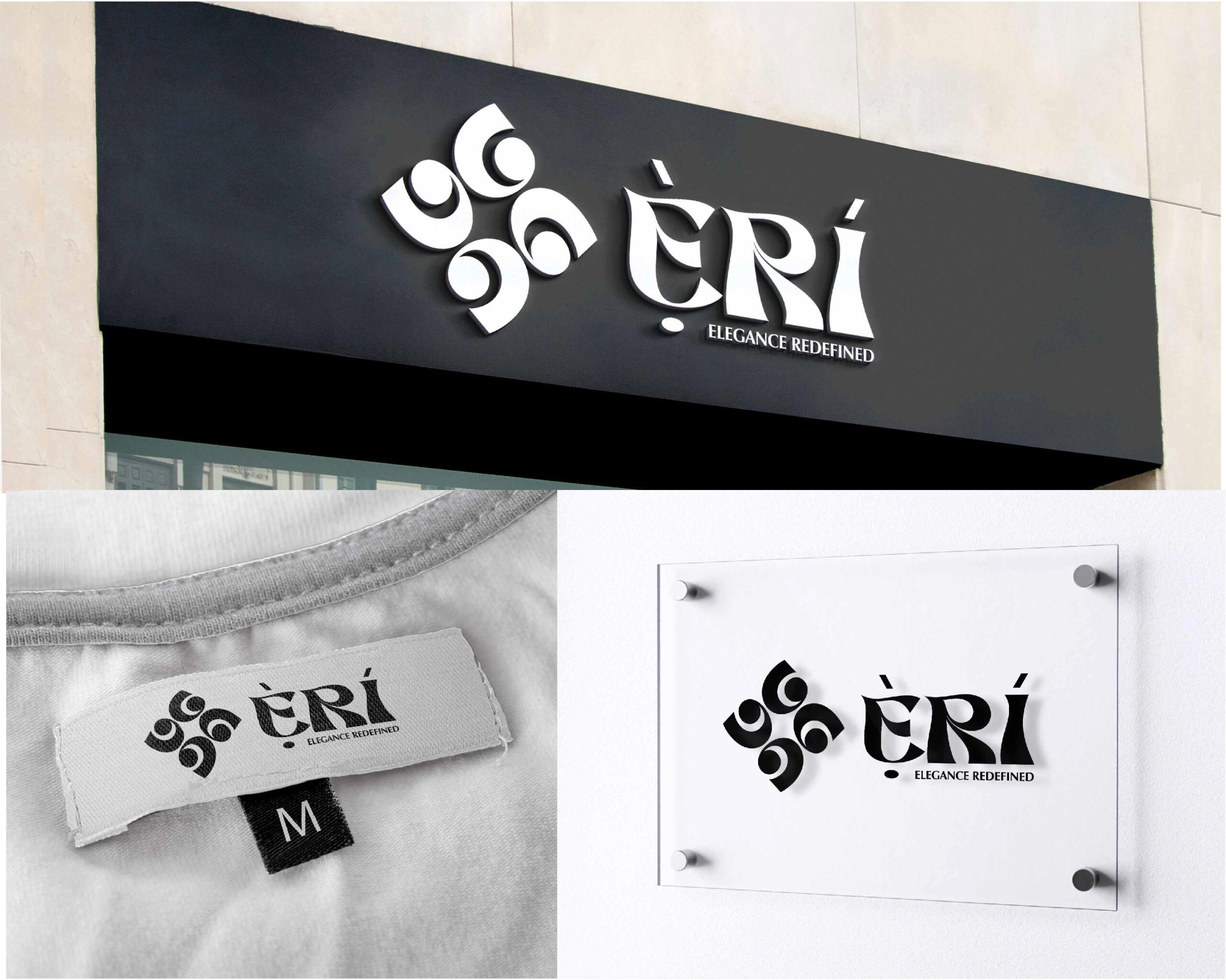
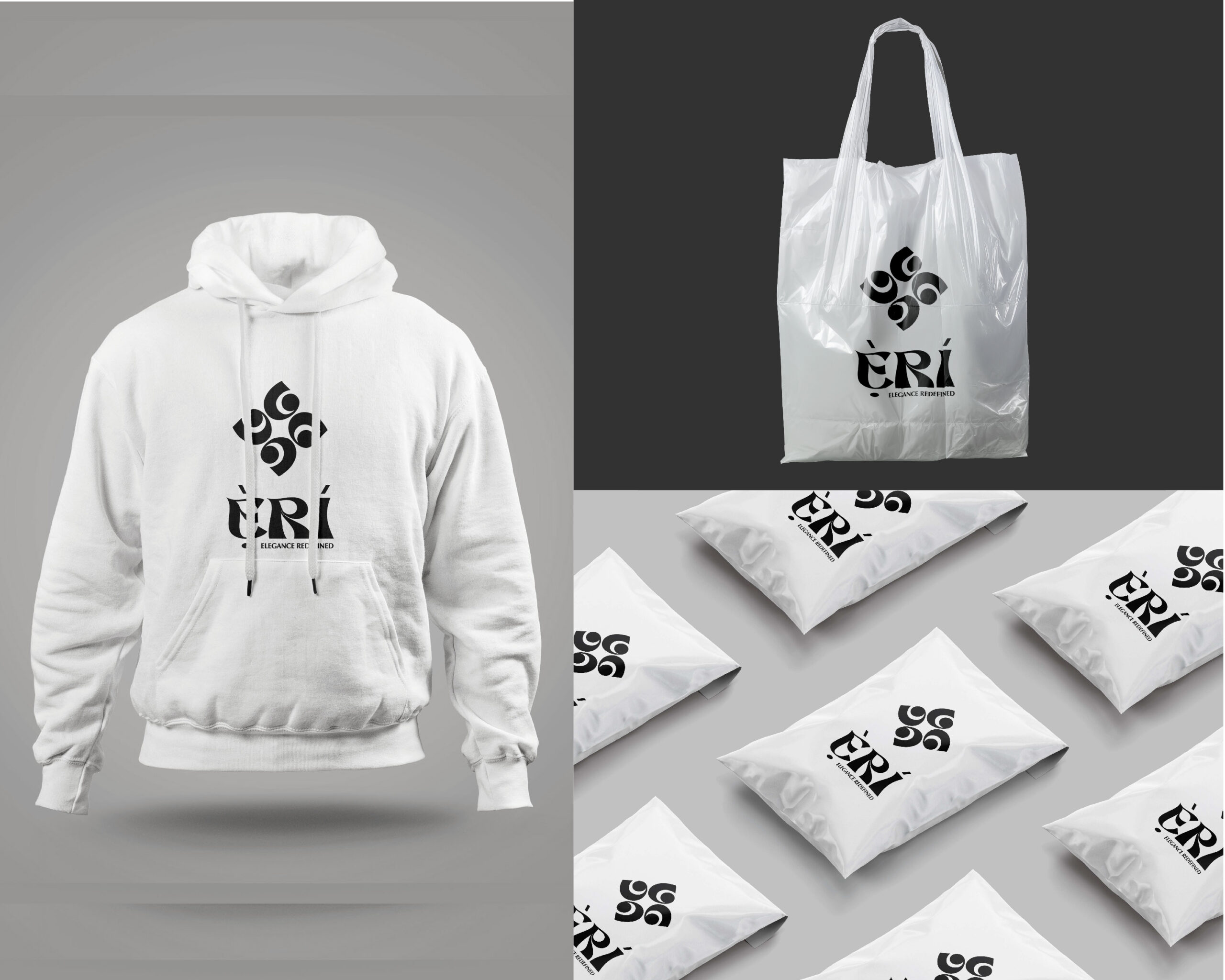
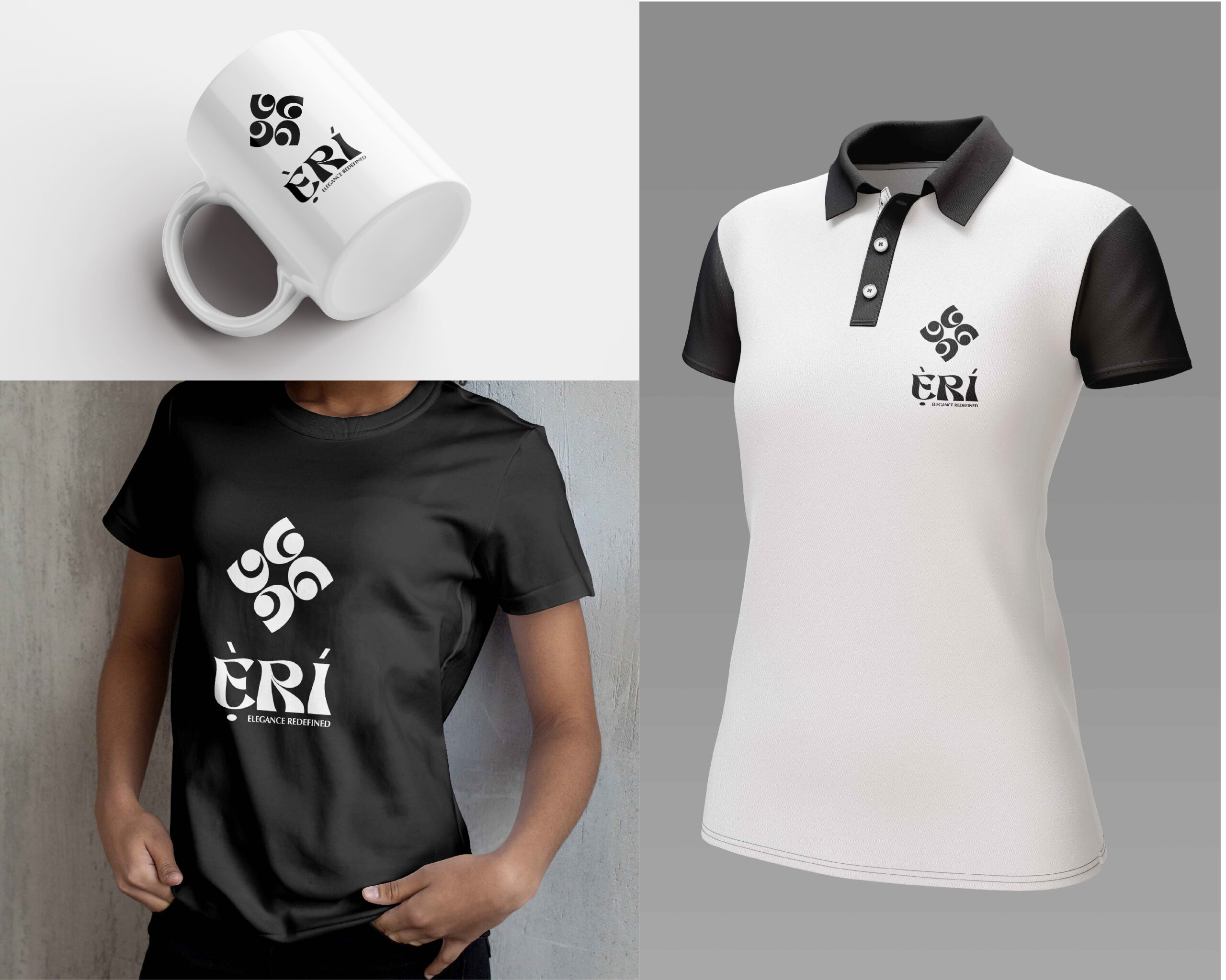
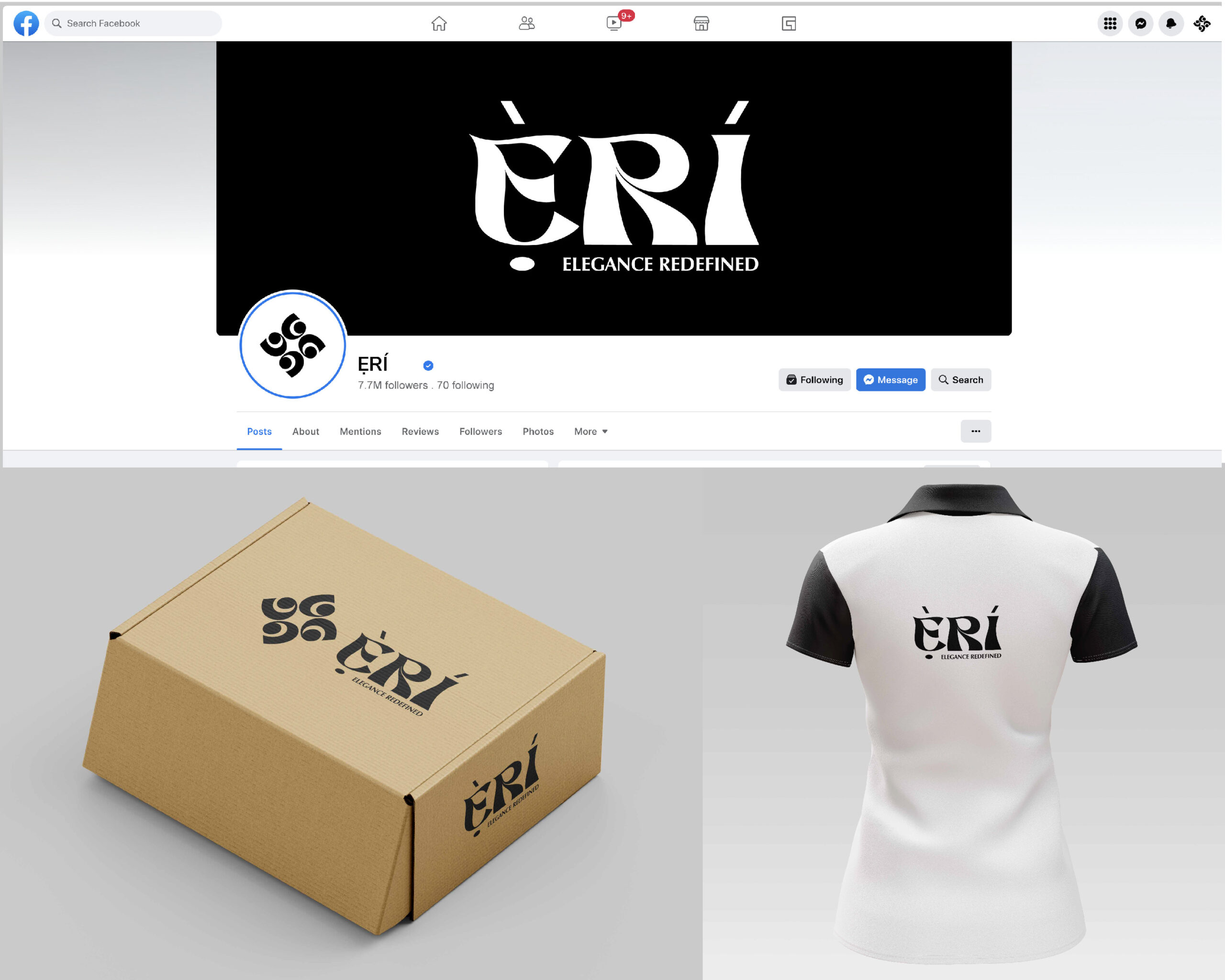
Ẹ̀RÍ required an identity system that could communicate refinement, cultural grounding, and modern structure through a restrained visual language. The objective was to develop a logo suite that balanced softness and precision while remaining adaptable across digital, print, packaging, and branded applications.
Approach & Implementation
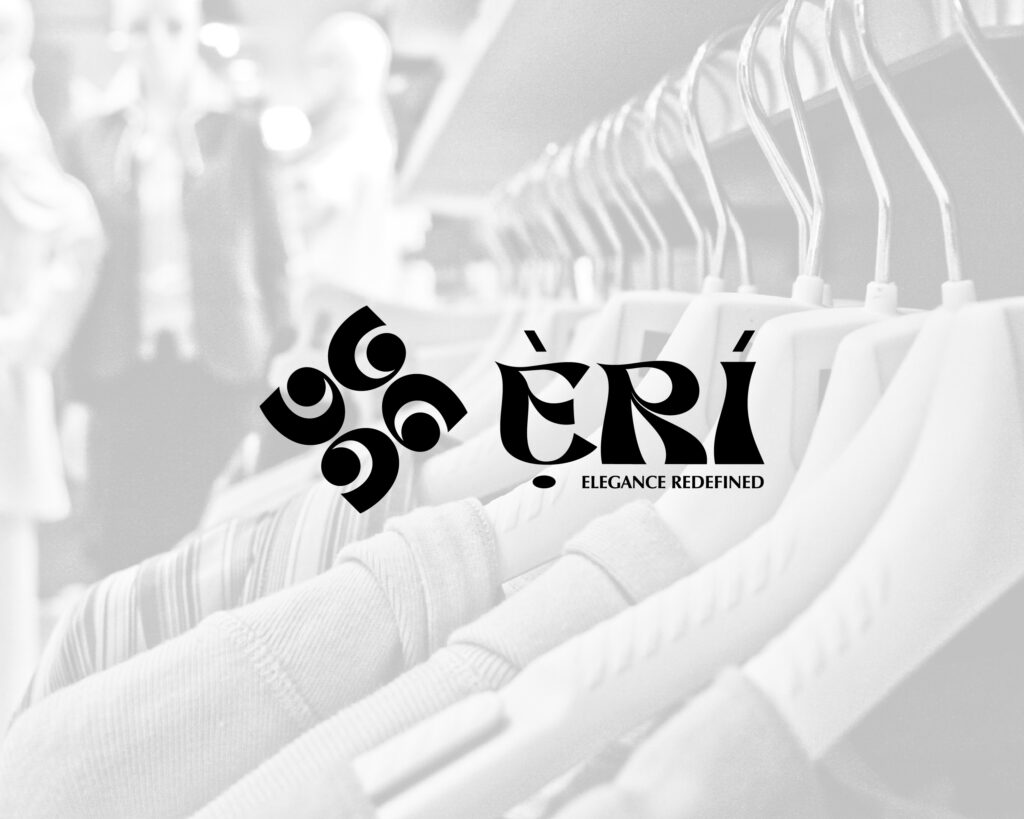
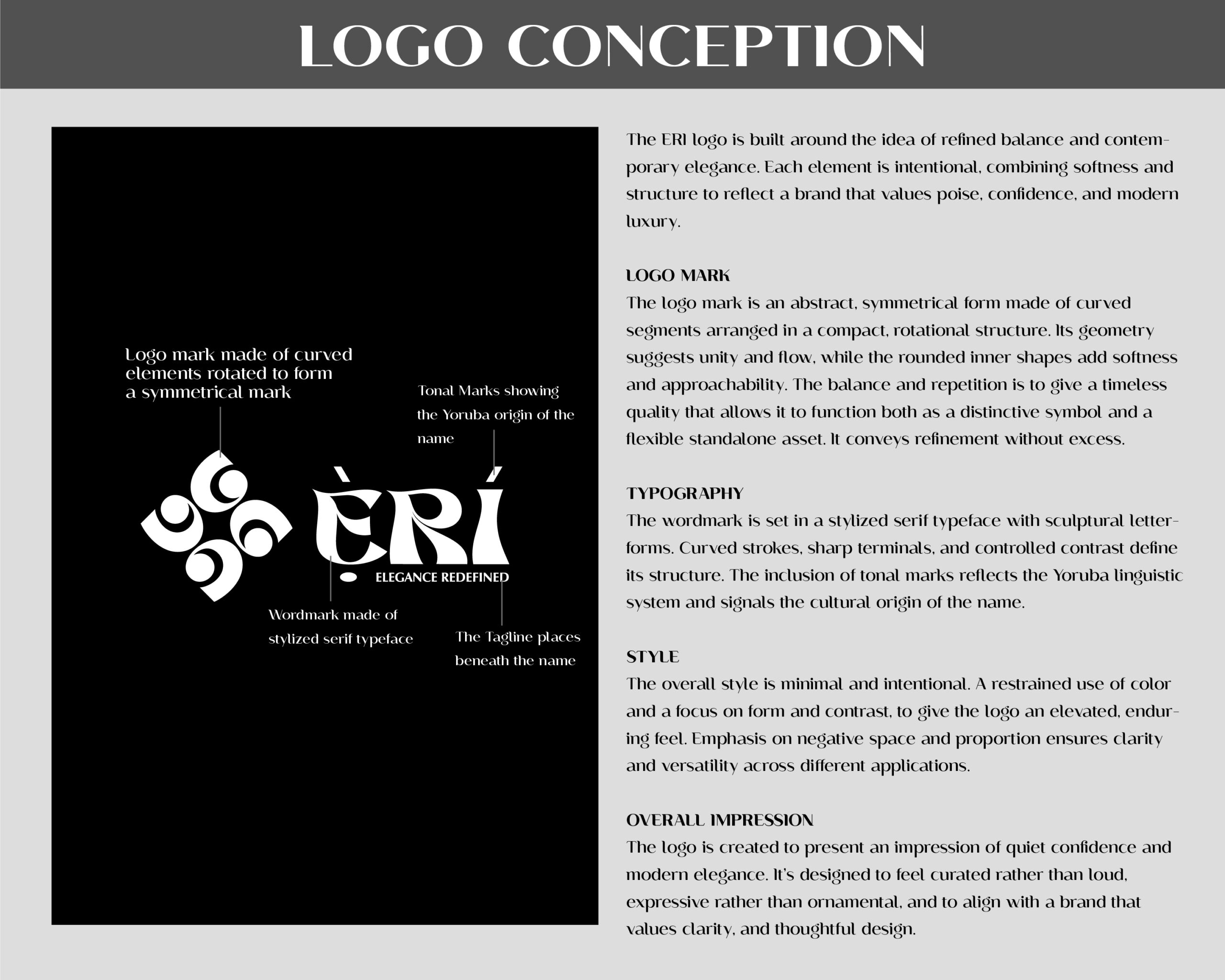
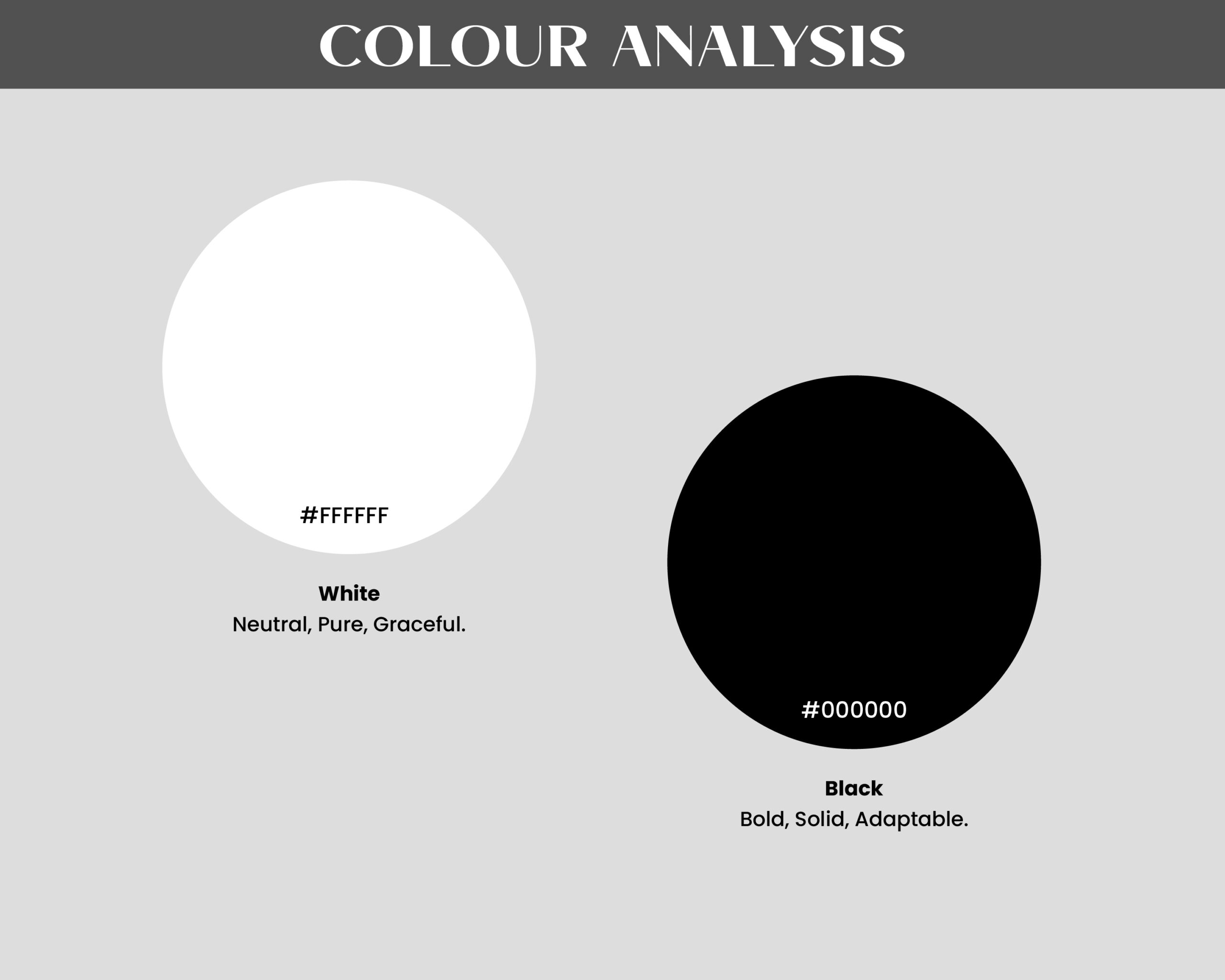
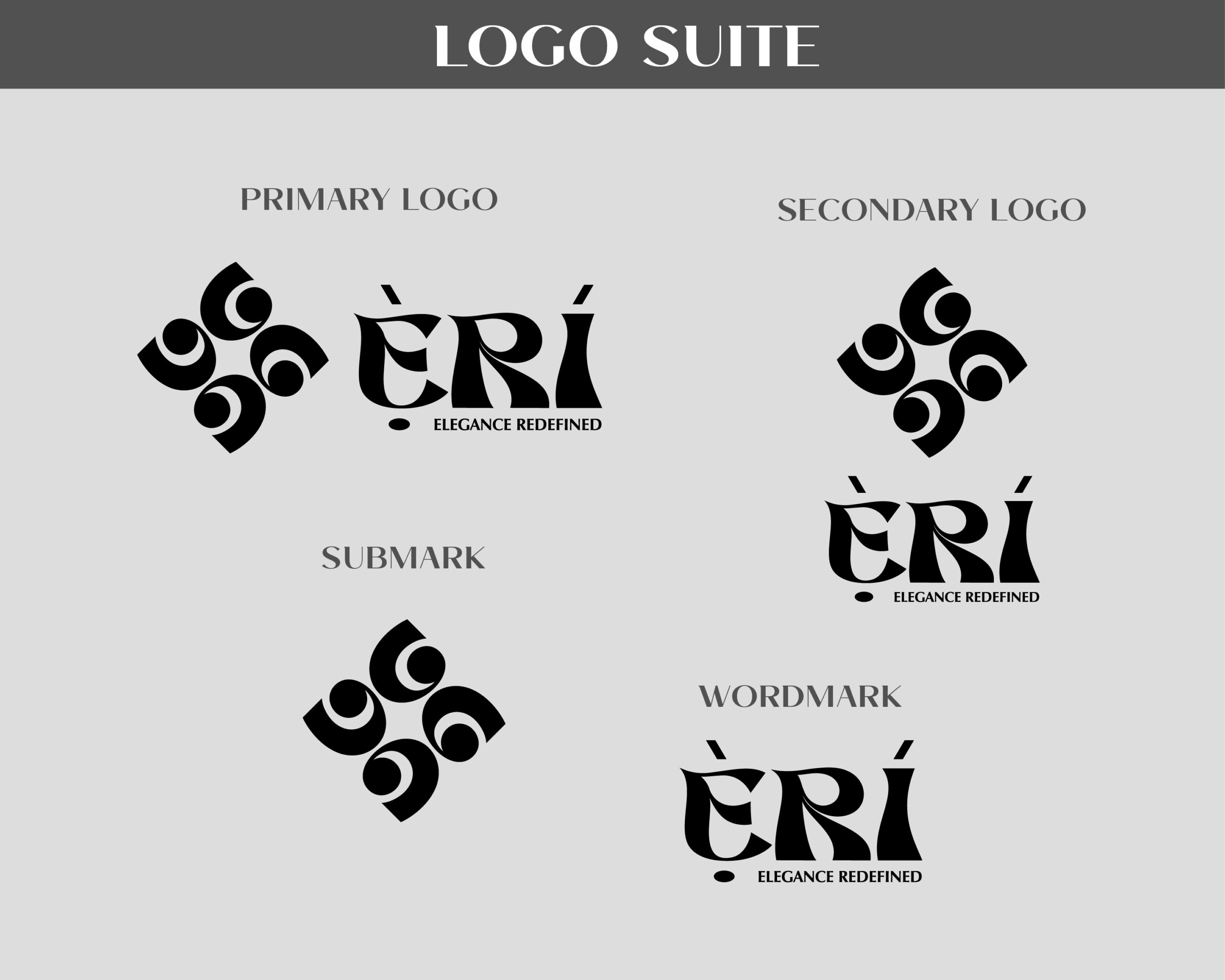
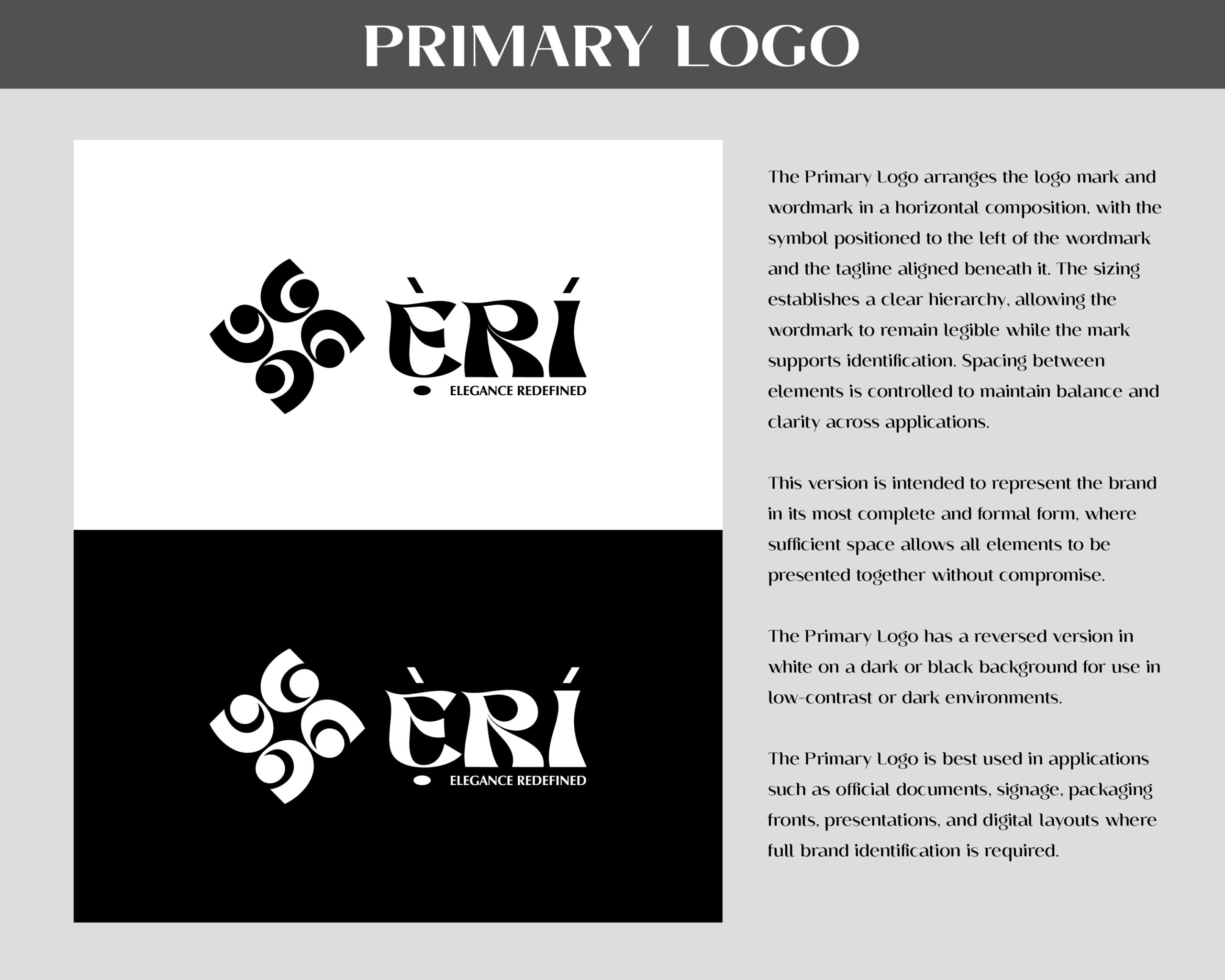
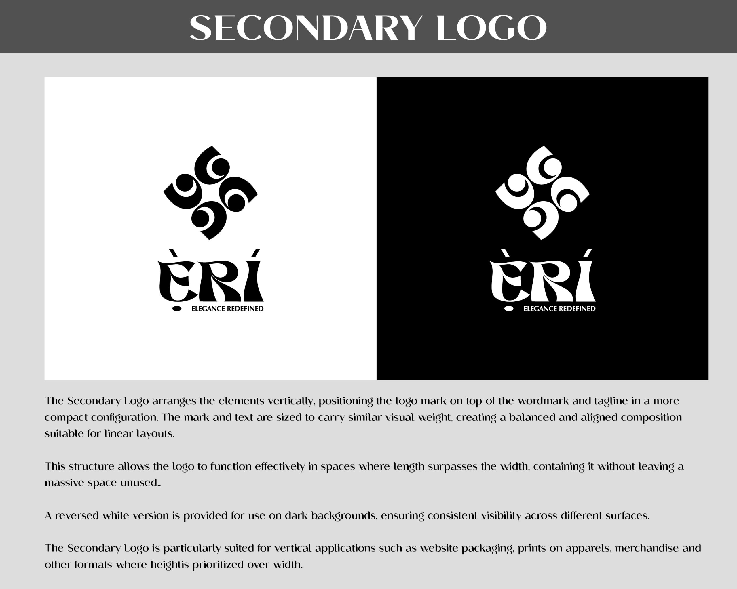
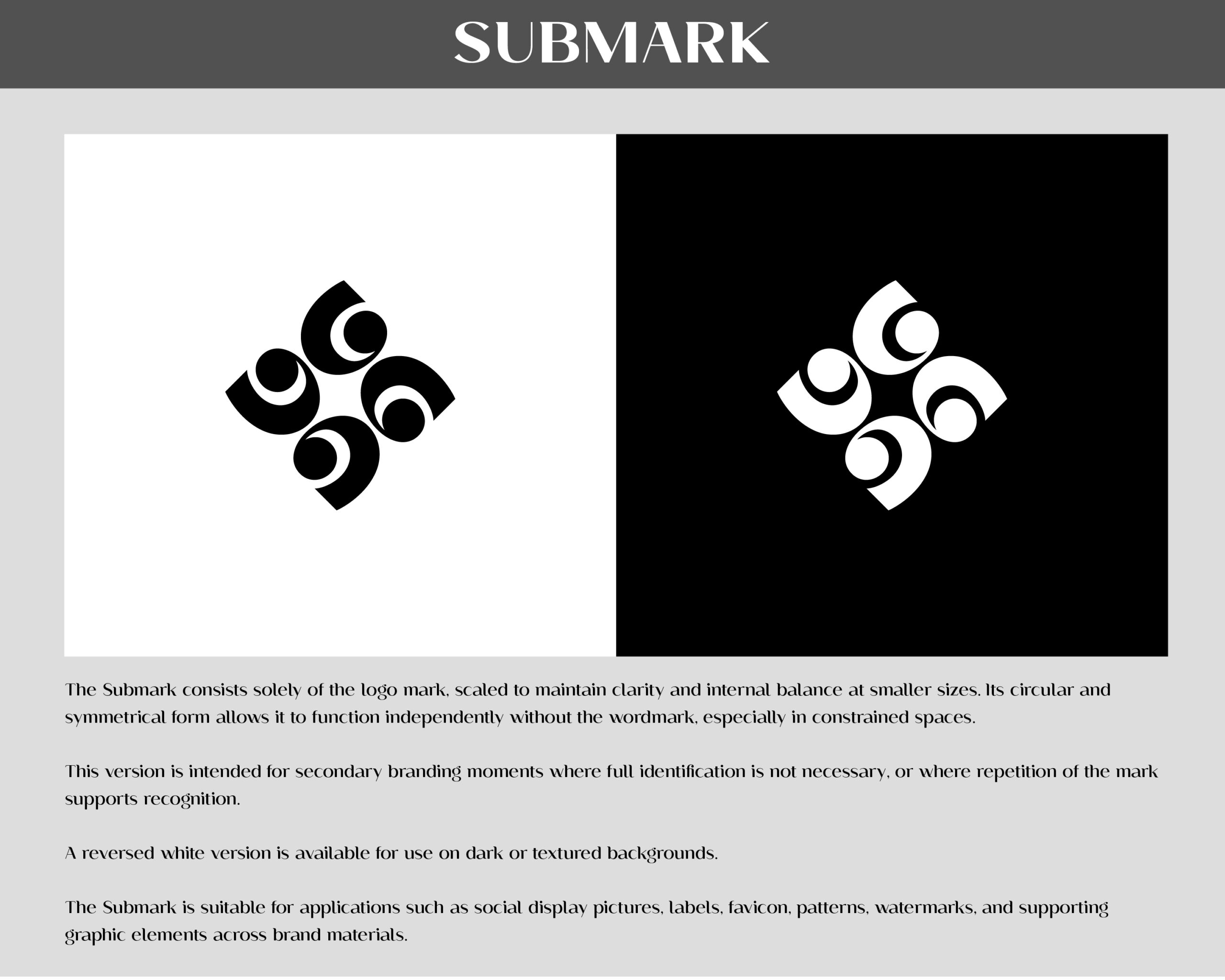
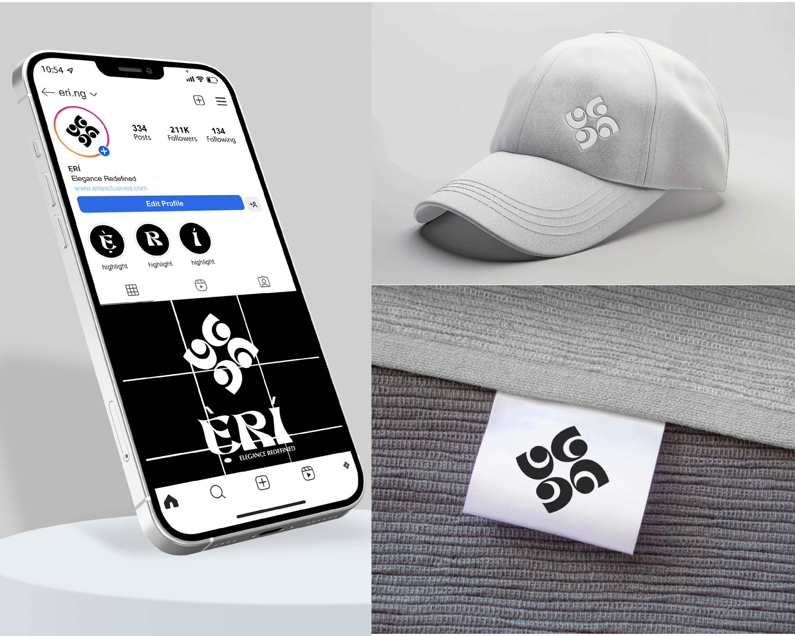
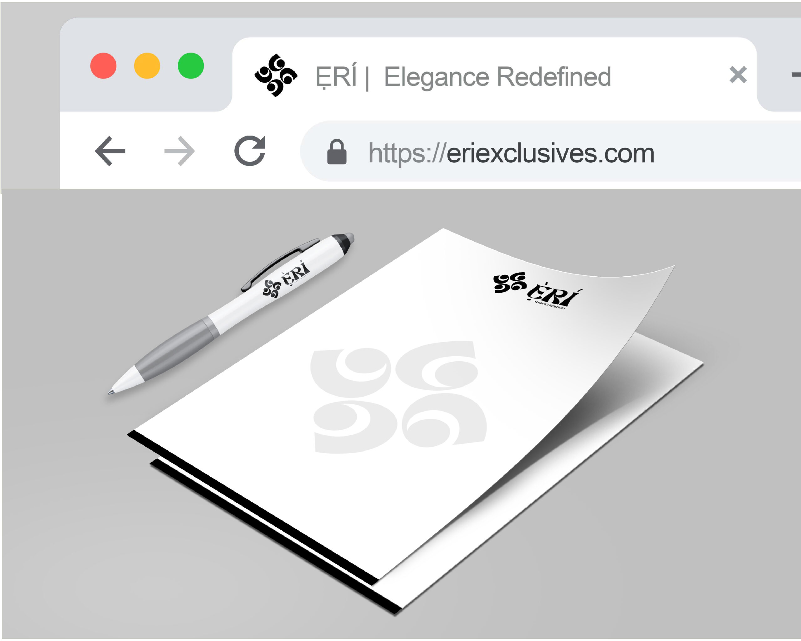
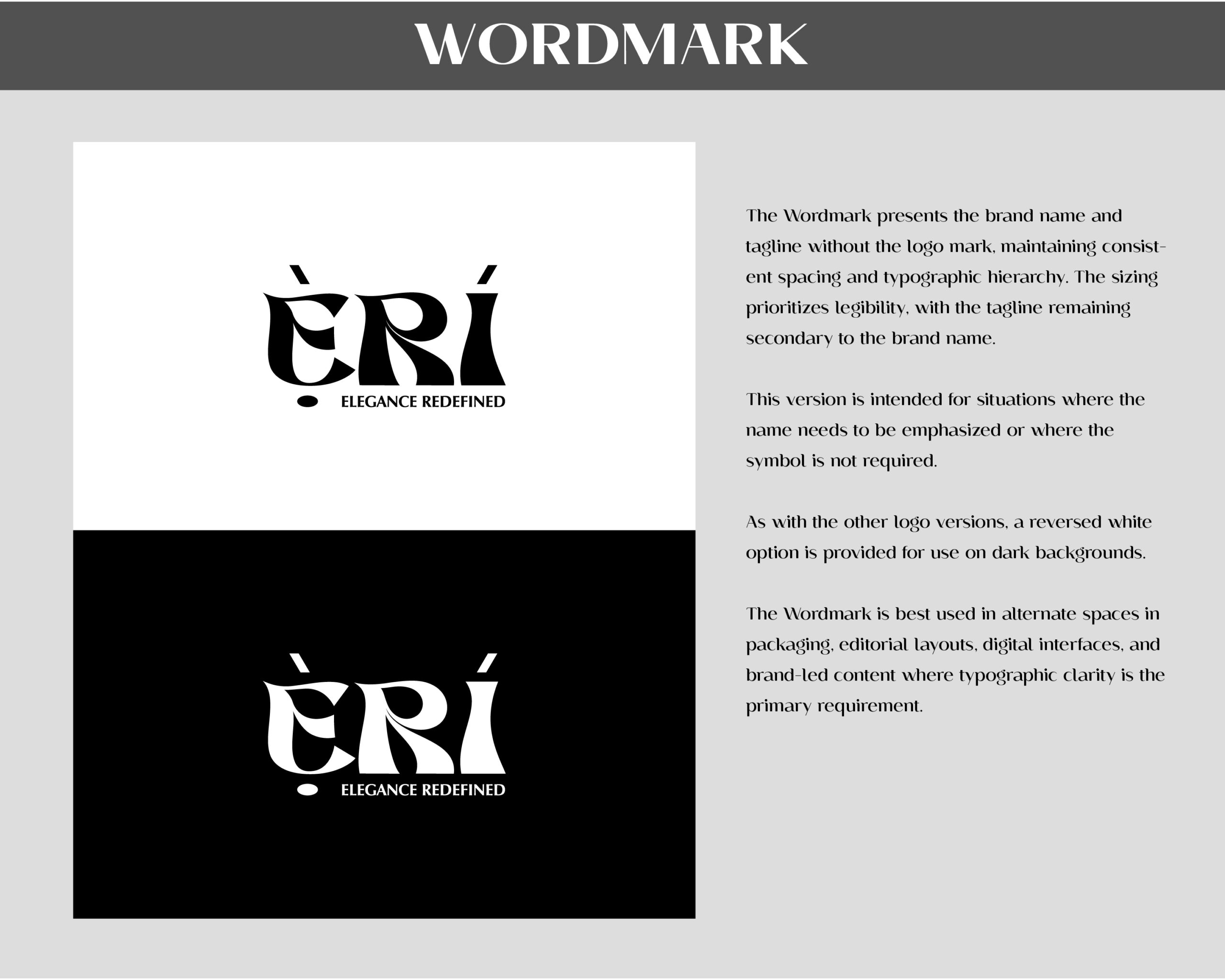
The identity for Ẹ̀RÍ was built around a symmetrical abstract mark formed from curved rotational elements to communicate balance, continuity, and refinement. A sculptural serif wordmark with tonal marks was paired with the symbol to preserve the Yoruba origin of the name while maintaining a contemporary structure. The system was expanded into multiple logo configurations including a primary logo, secondary logo, wordmark, and submark to support flexibility across print and digital applications. A restrained black-and-white colour system reinforced clarity, contrast, and adaptability throughout the brand identity.
Outcome
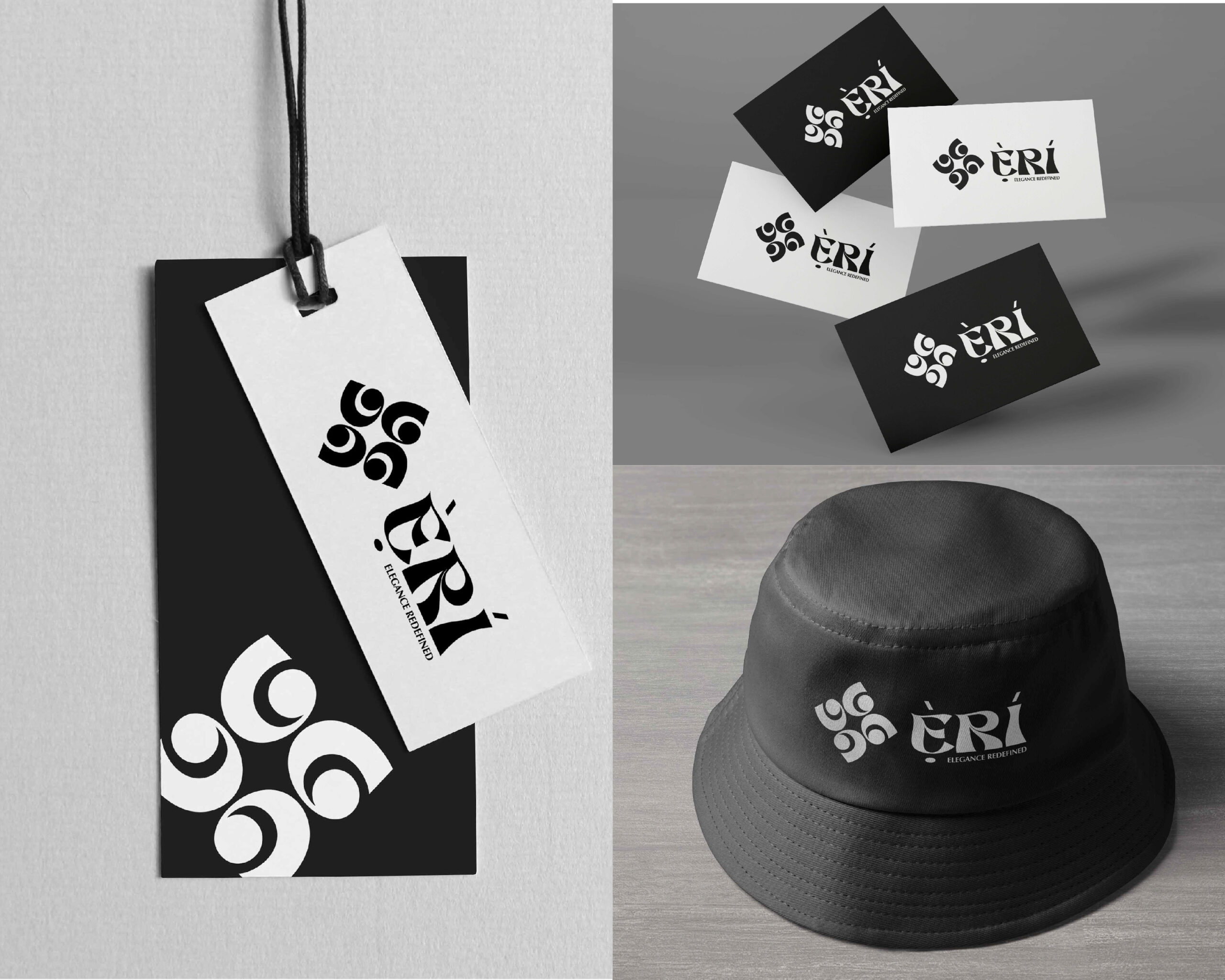
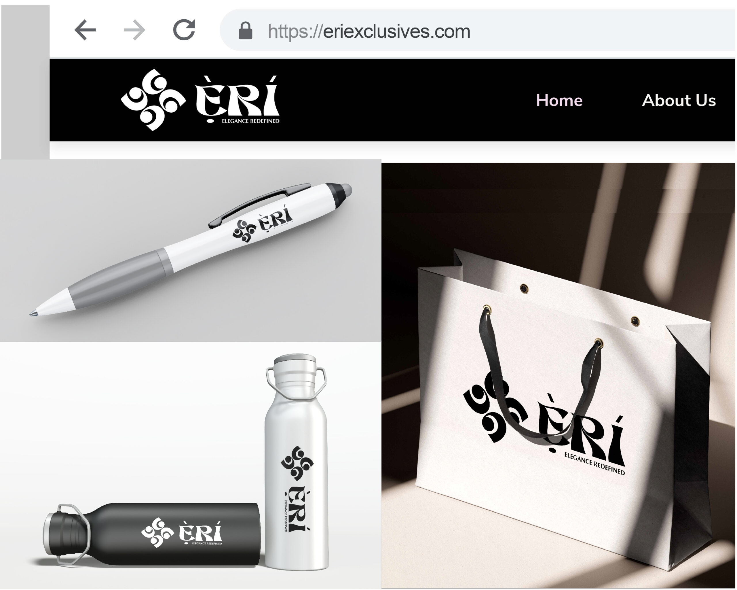
The resulting identity system provides Ẹ̀RÍ with a structured and adaptable visual presence centered on clarity, proportion, and restraint. The system establishes a balance between contemporary elegance and cultural detail while remaining functional across a range of physical and digital touchpoints.
Happy Viewing 👇🏽✨