Project Brief
BRISUN is a developing conglomerate positioning itself to operate across multiple industries, including fashion, hospitality, and beauty. The challenge was to build a brand identity system that could remain consistent and recognizable while being flexible enough to adapt across diverse sectors. The brand needed to communicate calmness, reliability, and ease, without feeling limited to a single niche or overly corporate.
Approach & Implementation
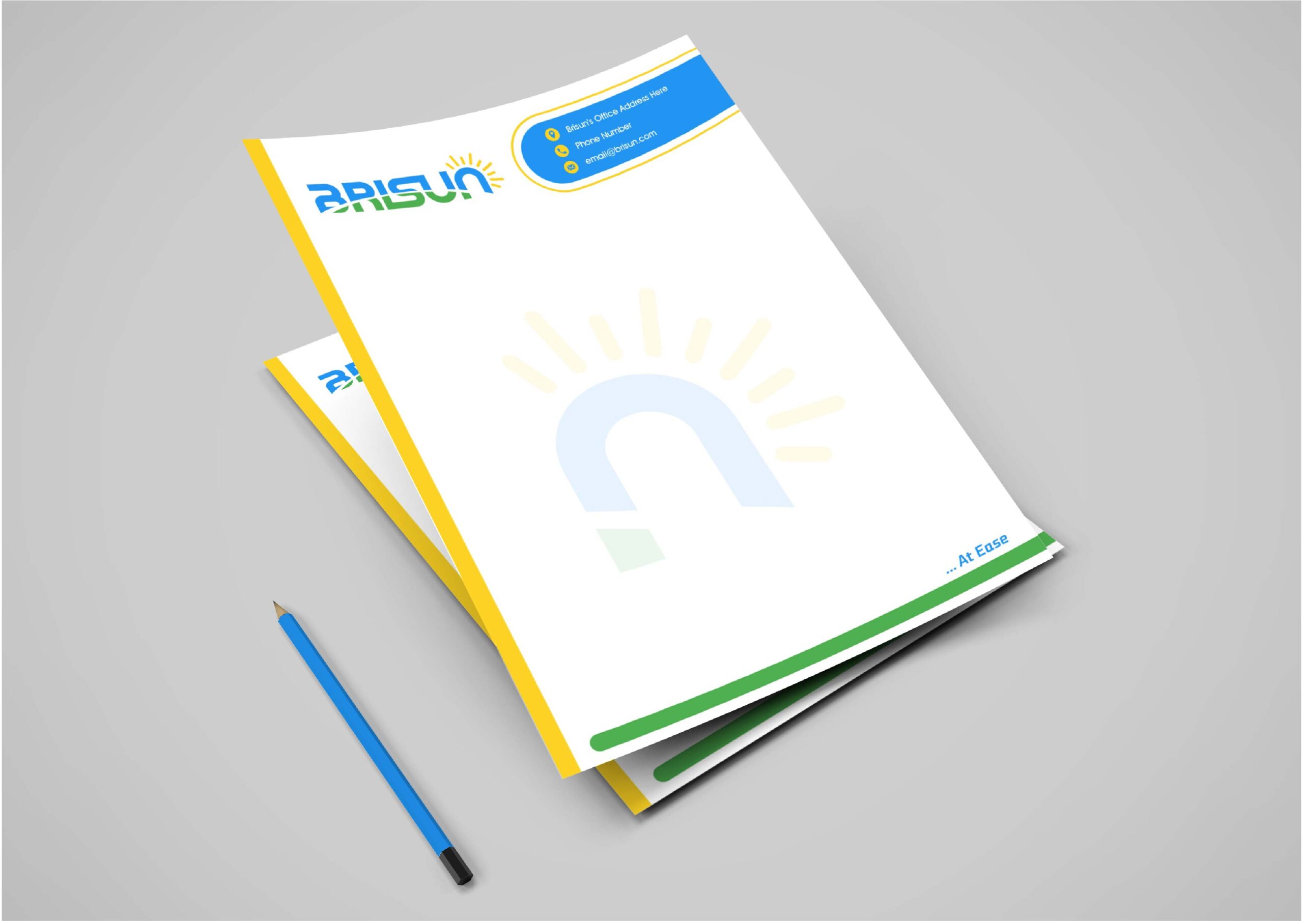
The identity was built around a unified visual and verbal system designed to scale. A distinctive logo and submark were developed alongside a structured color palette and a repeatable brand pattern derived from core brand elements. Typography and layout systems were defined to ensure clarity and hierarchy across applications.
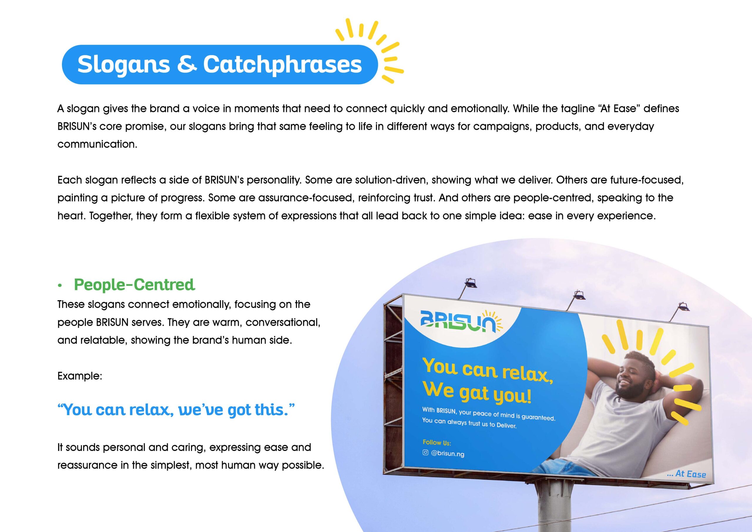
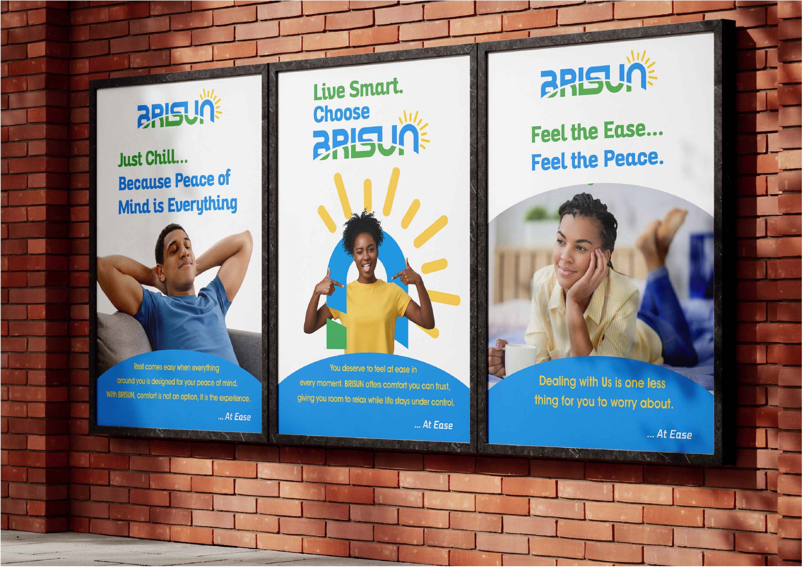
On the communication side, a set of adaptable slogans and messaging styles were created to maintain a consistent tone while allowing flexibility across different contexts. Supporting visual elements, including imagery direction and composition styles, were refined to reinforce a calm, stable, and reassuring brand presence across all touchpoints.
Outcome
The result is a cohesive brand system that provides both structure and flexibility. BRISUN now has a clear visual identity and communication framework that can extend across multiple industries without losing consistency. The brand presents itself as calm, dependable, and adaptable, with a system that supports both immediate application and long-term growth.
Happy Viewing 👇🏽✨